Designing Responsive Experiences That Fit Everywhere


Your Website, Perfect on Every Device — No Exceptions
1
Mobile-First Design Strategy
2
Multi-Device Compatibility
3
Enhanced SEO Performance
4
Better Engagement
5
Goes with you in the future
All Devices. One Experience. Maximum Impact.

Give Users the Experience They Expect, No Matter the Screen Size
Seamless Across Devices
Your website should look and perform flawlessly on desktops, tablets, and smartphones. Our responsive designs ensure a smooth, engaging experience—no matter where your audience is.
Enhanced User Engagement
A great design isn’t just about aesthetics—it’s about interaction. We craft intuitive, user-friendly interfaces that keep visitors engaged and drive meaningful actions.
Stronger Brand Presence
Your website is a reflection of your brand. We create designs that not only look stunning but also reinforce your brand identity, helping you stand out in a competitive market.
Explore our Responsive Website Portfolio
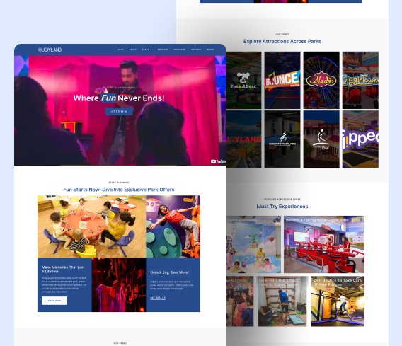
A.A. Joyland
A.A. Joyland leads the industry in providing recreational and amusement park facilities across Pakistan and the UAE.
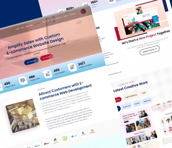
American Creative Studios
American Creative Studios crafts impactful marketing strategies that resonate and drive results for brands across the U.S.
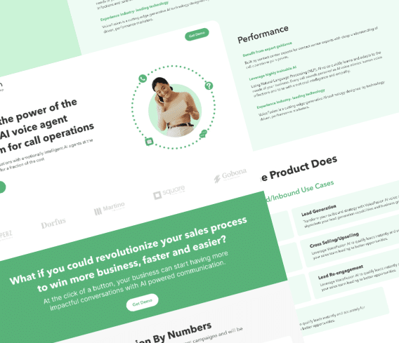
Voice Fusion
Voice Fusion revolutionizes call center interactions with its cutting-edge AI voice agent.
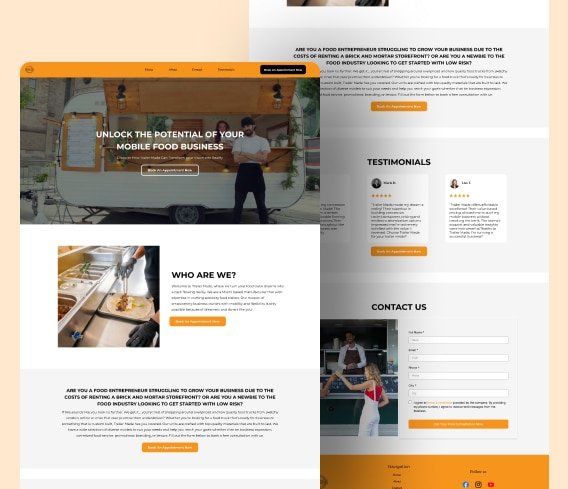
Trailer Made
Trailer Made supports small businesses with custom concession trailers, perfect for mobile ventures.
Frequently Asked Questions
Yes, responsive websites will perform better in search rankings because they provide a better user experience than sites that are not mobile-friendly. Google prioritizes mobile-friendly sites in search results.
Yes, we optimize images, code, and layouts to enhance speed, ensuring your site loads quickly and delivers a smooth experience on all devices.
A smooth bump-free user experience leads to higher engagement, lower bounce rates, and more conversions—whether it’s sales, sign-ups, or leads.
Yes, our expertise lies in responsive solutions for advanced features like e-commerce, booking systems, and interactive elements without compromising performance.
Timelines vary based on complexity, but we prioritize efficiency without cutting corners. Expect a structured process with clear milestones and updates.
We rigorously test your site on multiple devices, resolutions, and browsers to ensure flawless performance before it goes live.